The Evolution of a Design Idea
Some projects never truly leave you—they evolve with time, experience, and a fresh perspective. What began as a college assignment in 2015 transformed into a passion project I’ve revisited every few years, refining and reimagining its purpose. From a nostalgic hard cider concept to a boutique bakery brand, this project is a testament to my growth as a designer and my love for storytelling through visual identity.
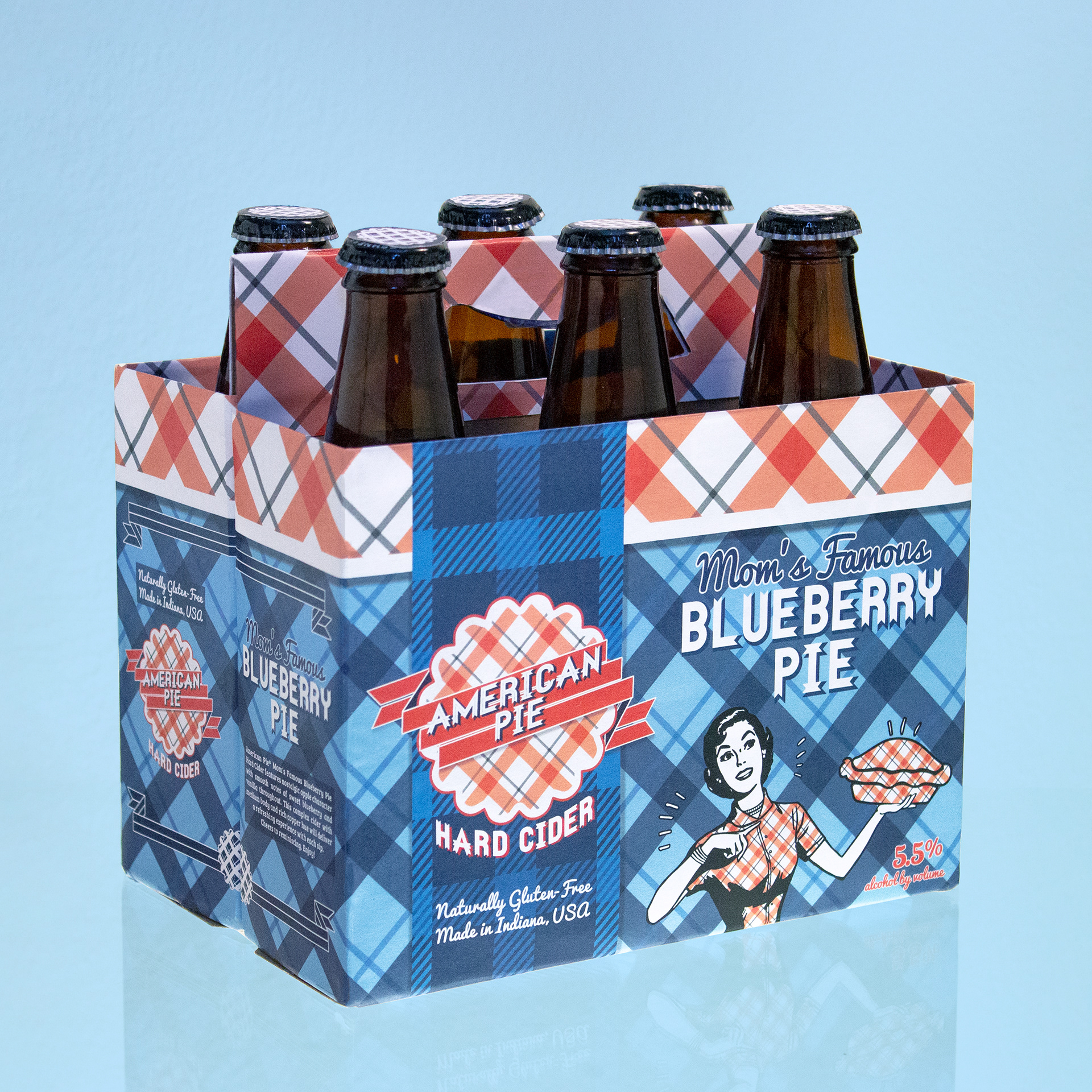
2015: American Pie Hard Cider
Ah, humble beginnings. This project was born as a college assignment, where I set out to create a pie-flavored cider that captured the essence of mid-century Americana. I printed, cut, and pasted my custom packaging design onto a dismantled six-pack of Woodchuck Cider, then photographed the result. While I loved certain elements, I quickly realized there were design mistakes that needed refining. A year later, I stripped away the overly busy packaging and showcased only the bottle cap logo in my portfolio—knowing this idea wasn’t quite done with me yet.

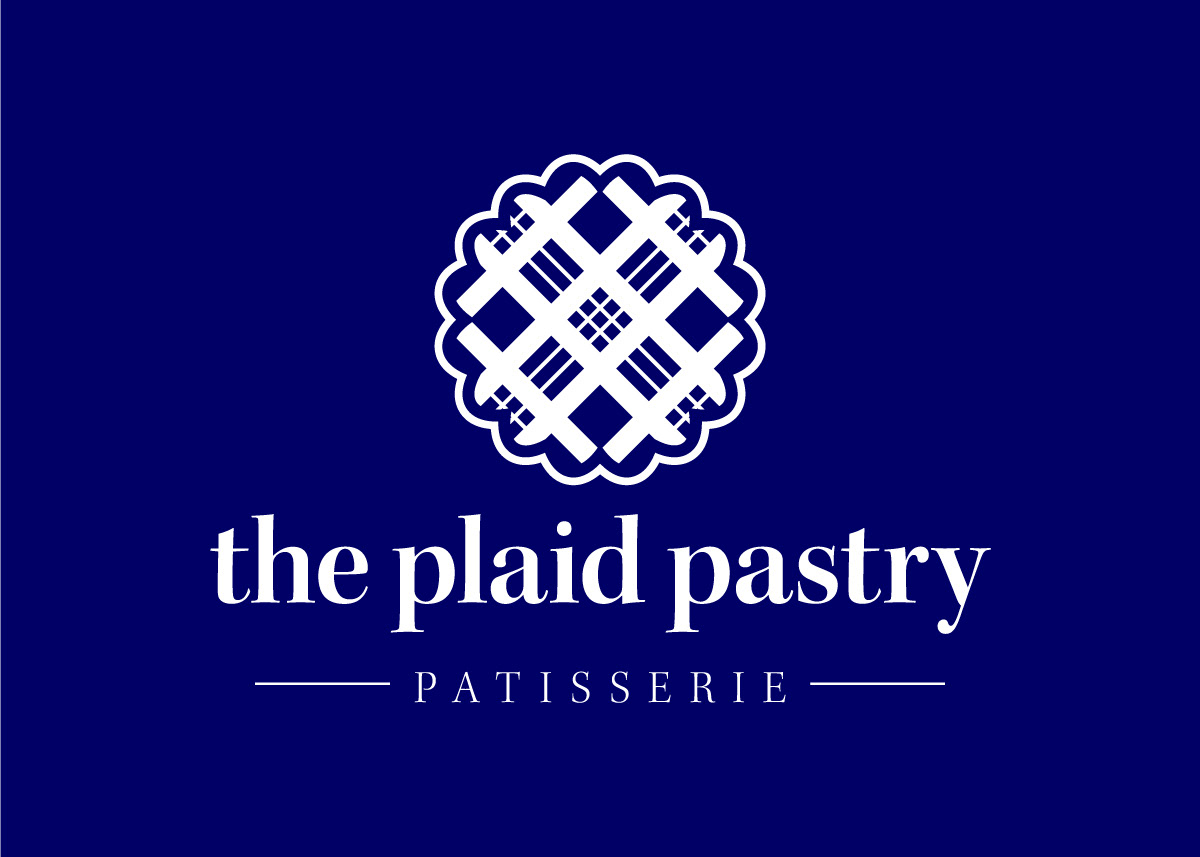
2019: The Plaid Pastry Patisserie
After gaining experience in the corporate design world, I returned to this project with a more mature eye. I recognized the strongest element—the plaid pie crust logo—and decided to give it new life. Retiring the hard cider concept, I rebranded it as a bakery, landing on the alliterative name "The Plaid Pastry." My inspiration? A timeless French patisserie. With this new direction, the project evolved into a sophisticated yet inviting brand identity. But its journey wasn’t over just yet.
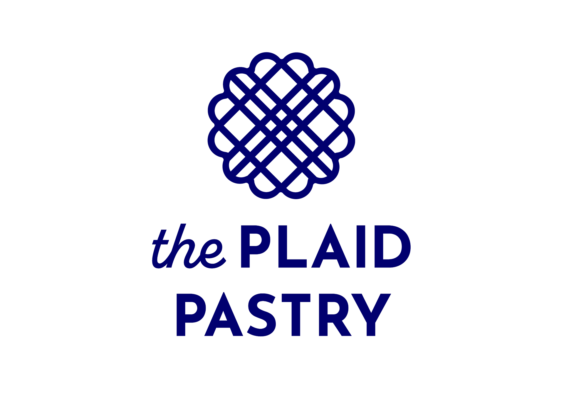
2022: The Plaid Pastry
I reimagined the bakery as a youthful, trendy-yet-timeless, minimal-yet-bold coffee and bakery shop. Simple and geometric, the curves and straight lines echo between the logo and typography. The same stroke weight is carried throughout the logo and simplified the rather detailed shape. Inspired by the many boutique bakeries I saw when I lived in downtown Los Angeles.